

我想更改 nautilus 状态栏和工具栏的背景和字体颜色。(我希望面包屑所在的栏是工具栏。)
我可以看到编辑~/.gtkrc-2.0有助于更改侧边栏以及其他小部件,但找不到合适的示例。
答案1
我将 ambiance-theme 修改为深色工具栏(包括 nautilus、banshee 等),并将其他一些更改修改为较小的滚动条。我的更改基于 Wasp 主题(参见 gnome-look)。
它看起来像这样: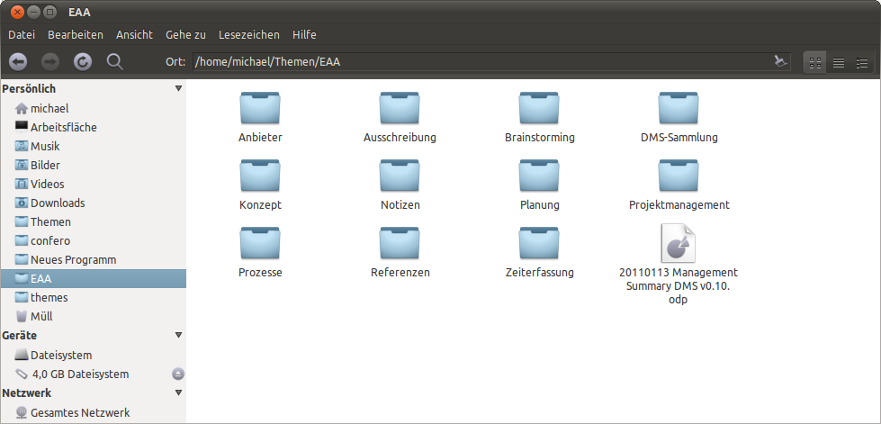
您可以在这里找到整个主题:带有深色工具栏的氛围主题
这些图标是 AwOken 和 Faenza 的个人混合。如果您感兴趣,我可以发布它。
我修改后的 gtkrc 以适应氛围:
gtk-color-scheme = "base_color:#ffffff\nfg_color:#4c4c4c\ntooltip_fg_color:#ffffff\nselected_bg_color:#7EA2B8\nselected_fg_color:#FFFFFF\ntext_color:#3C3C3C\nbg_color:#F2F1F0\ntooltip_bg_color:#000000\nlink_color:#7EA2B8"

gtk-icon-sizes = "panel-menu=22,22:gtk-button=16,16"

gtk-auto-mnemonics = 1

style "default" {
    xthickness = 1
    ythickness = 1

    #######################
    # Style Properties
    #######################
    GtkWidget::new-tooltip-style = 1
    GtkButton::child-displacement-x = 1
    GtkButton::child-displacement-y = 1
    GtkButton::default-border = { 0, 0, 0, 0 }

    GtkCheckButton::indicator-size = 16

    GtkPaned::handle-size = 0  #MSE

    GtkRange::trough-border = 0
    GtkRange::slider-width = 14
    GtkRange::stepper-size = 16
    GtkRange::trough-under-steppers = 1

    GtkScale::trough-border = 0
    GtkScale::slider-width = 23
    GtkScale::slider-length = 14
    GtkScale::trough-side-details = 1

    GtkScrollbar::activate-slider = 1
    GtkScrollbar::trough-border = 0
    GtkScrollbar::stepper-size = 0
    GtkScrollbar::slider-width = 7
    GtkScrollbar::min-slider-length = 31
    GtkScrollbar::has-backward-stepper  = 0
    GtkScrollbar::has-forward-stepper   = 0

    GtkScrolledWindow::scrollbar-spacing = 2
    GtkScrolledWindow::scrollbars-within-bevel = 1

    GtkMenuBar::internal-padding = 0
    GtkExpander::expander-size = 11
    GtkToolbar::internal-padding = 1
    GtkToolbar::shadow-type = GTK_SHADOW_NONE
#   GtkTreeView::expander-size = 7
#   GtkTreeView::vertical-separator = 0
#   GtkTreeView::odd-row-color = shade (0.96, @base_color) # MSE
    GtkNotebook::tab-overlap = -1

    GtkMenu::horizontal-padding = 0
    GtkMenu::vertical-padding = 0

    WnckTasklist::fade-overlay-rect = 0
    # The following line hints to gecko (and possibly other appliations)
    # that the entry should be drawn transparently on the canvas.
    # Without this, gecko will fill in the background of the entry.
    GtkEntry::honors-transparent-bg-hint = 1
    GtkEntry::state-hint = 0
    GtkEntry::progress-border = { 2, 2, 2, 2 }

    GtkProgressBar::min-horizontal-bar-height = 14
    GtkProgressBar::min-vertical-bar-width = 14

    GtkImage::x-ayatana-indicator-dynamic = 1
    GtkMenuBar::window-dragging = 1

    GtkWidget::link-color = @link_color
    GtkWidget::visited-link-color = @text_color

    ####################
    # Color Definitions
    ####################
    bg[NORMAL]        = @bg_color
    bg[PRELIGHT]      = shade (1.02, @bg_color)
    bg[SELECTED]      = @selected_bg_color
    bg[INSENSITIVE]   = shade (0.95, @bg_color)
    bg[ACTIVE]        = shade (0.9, @bg_color)

    fg[NORMAL]        = @fg_color
    fg[PRELIGHT]      = @fg_color
    fg[SELECTED]      = @selected_fg_color
    fg[INSENSITIVE]   = darker (@bg_color)
    fg[ACTIVE]        = @fg_color

    text[NORMAL]      = @text_color
    text[PRELIGHT]    = @text_color
    text[SELECTED]    = @selected_fg_color
    text[INSENSITIVE] = shade (0.8, @bg_color)
    text[ACTIVE]      = darker (@text_color)

    base[NORMAL]      = @base_color
    base[PRELIGHT]    = shade (0.98, @bg_color)
    base[SELECTED]    = @selected_bg_color
    base[INSENSITIVE] = shade (0.97, @bg_color)
    base[ACTIVE]      = shade (0.94, @bg_color)

    engine "murrine" {
        contrast = 0.6
        arrowstyle = 2
        reliefstyle = 3
        highlight_shade = 1.0
        glazestyle = 0
        default_button_color = shade (1.1, @selected_bg_color)
        gradient_shades = {1.1, 1.0, 1.0, 0.9}
        roundness = 4
        lightborder_shade = 1.26
        lightborderstyle = 1
        listviewstyle = 2
        progressbarstyle = 0
        colorize_scrollbar = TRUE #FALSE #MSE
        menubaritemstyle = 1
        menubarstyle = 1
        menustyle = 2
        focusstyle = 3
        handlestyle = 1
        sliderstyle = 3
        scrollbarstyle = 0 #2
        stepperstyle = 3
#       rgba = TRUE
    }
}

style "dark"
{
    fg[NORMAL]        = "#dfdbd2"
    fg[PRELIGHT]      = "#fff"
    fg[ACTIVE]        = "#fff"
    fg[SELECTED]      = "#fff"
    fg[INSENSITIVE]   = shade (0.5, "#3c3b37")

    bg[NORMAL]        = "#3c3b37"
    bg[PRELIGHT]      = shade (1.0, "#4D4C48")
    bg[ACTIVE]        = shade(0.94, "#3c3b37")
    bg[SELECTED]      = shade(1.0, @selected_bg_color)
    bg[INSENSITIVE]   = "#3c3b37"

    base[NORMAL]      = "#3c3b37" #"#333230"
    base[PRELIGHT]    = shade (0.95, @bg_color)
    base[ACTIVE]      = shade (0.55, @bg_color)
    base[SELECTED]    = shade (1.0, @selected_bg_color)
    base[INSENSITIVE] = @bg_color

    text[NORMAL]      = "#dfdbd2"
    text[PRELIGHT]    = @base_color
    text[ACTIVE]      = @base_color
    text[SELECTED]    = @base_color
    text[INSENSITIVE] = mix (0.5, @bg_color, "#3c3b37")
}

style "narrow" {
    xthickness = 1
    ythickness = 1
}

style "wide" {
    xthickness = 2
    ythickness = 2
}

style "wider" {
    xthickness = 3
    ythickness = 3
}

style "entry" {
    xthickness = 3
    ythickness = 3

    engine "murrine" {
    }
}

style "vscale" {
}

style "hscale" {
}

style "button" = "wider"
{
    bg[NORMAL]   = shade (1.10, @bg_color)
    bg[PRELIGHT] = mix(0.82,shade (1.1, @bg_color),@selected_bg_color)
    bg[ACTIVE]   = shade (0.85, @bg_color)

    engine "murrine"
    {
        border_shades       = { .8, .5} # draw a gradient on the border.
        #border_colors       = { "#D9D4CC", "#D9D4CC" }
        border_colors       = { @bg_color, @bg_color}
        contrast = 1.4
        lightborder_shade = 1.06
    }
}
style "notebook_button" {

    xthickness = 3
    ythickness = 3

    bg[NORMAL] = @bg_color
    bg[PRELIGHT] = shade (1.04, @bg_color)
    bg[ACTIVE] = shade (0.96, @bg_color)
    bg[INSENSITIVE] = @bg_color

    engine "murrine" {
        textstyle = 1
        border_shades = {0.95, 0.88}
        glowstyle = 5
        glow_shade = 1.02
        lightborder_shade = 1.32
    }
}

style "spinbutton" = "notebook_button" {
    xthickness = 4

    engine "murrine" {
    }
}

style "scrollbar" = "button" {  #"button"
    xthickness = 2
    ythickness = 2

    bg[NORMAL] = "#3c3b37"
    bg[PRELIGHT] = shade (1.10, "#3c3b37")
        bg[ACTIVE] = shade (1.10, "#3c3b37")

    engine "murrine"
    {
        border_shades = {0.95, 0.90}
        roundness = 20
        contrast = 1.0
        trough_shades = {0.92, 0.98}
        lightborder_shade = 1.3
        glowstyle = 5
        glow_shade = 1.02
        gradient_shades = {1.2, 1.0, 1.0, 0.86}
        trough_border_shades = {0.9, 0.98}
    }
}

style "hscrollbar" {
}

style "vscrollbar" {
}

style "scale" = "button" {
    bg[NORMAL] = @bg_color
    bg[PRELIGHT] = shade (1.06, @bg_color)
    bg[ACTIVE] = shade (0.94, @bg_color)

    engine "murrine" {
        contrast = 0.6
        border_shades = {0.9, 0.8}
        roundness = 5
        lightborder_shade = 1.32
        gradient_shades = {1.1, 1.0, 1.0, 0.8}
        handlestyle = 2
        trough_border_shades = {0.9, 1.4}
        glow_shade = 1.0
#       reliefstyle = 2
#       shadow_shades = { 1.0, 0.9 }
    }
}

style "notebook_bg" {
    bg[NORMAL] = shade (1.02, @bg_color)
    bg[ACTIVE] = shade (0.97, @bg_color)
    fg[ACTIVE] = mix (0.8, @fg_color, shade (0.97, @bg_color))
}

# The color is changed by the notebook_bg style, this style
# changes the x/ythickness
style "notebook" {
    xthickness = 2
    ythickness = 2

    engine "murrine" {
        roundness = 3
        contrast = 0.8
        focusstyle = 2
        lightborder_shade = 1.16
        gradient_shades = {1.1, 1.0, 1.0, 0.68}
    }
}

style "statusbar" {
    engine "murrine" {
        contrast = 1.2
    }
}

style "comboboxentry" = "notebook_button" {
    xthickness = 3
    ythickness = 3

    engine "murrine" {
        textstyle = 1
        glowstyle = 5
        glow_shade = 1.02
    }
}

style "menubar" = "dark" {
    engine "murrine" {
        textstyle = 2
        text_shade = 0.33
        gradient_shades = {1.0, 1.0, 1.0, 1.0}
        lightborder_shade = 1.23
    }
}
style "dark-toolbar" = "dark"
{
    xthickness = 3
    ythickness = 3
    bg[NORMAL] = "#3c3b37" #"#343330"
    bg[PRELIGHT] =  shade (0.65, @selected_bg_color)
    bg[SELECTED] =  shade (0.35, @bg_color)
    bg[ACTIVE] =  shade (0.35, @bg_color)

    engine "murrine"
    {
        border_shades = {1.3, 1.1} # draw a gradient on the border.
        border_colors = {"#3c3b37", "#3c3b37"}#{ "#343330", "#343330" }
        glowstyle = 4
        gradient_shades = {1.05,1.0,1.0,0.9}
            highlight_shade = 1.1
            lightborder_shade   = 1.05
            reliefstyle = 4     # 0 = flat, 1 = inset, 2 = shadow, = 3 for a gradient on shadow, = 4 for a stronger shadow.
            contrast = 1.4
    }
}

style "dark-toolbar-sep" = "dark-toolbar"
 { xthickness = 2 }


style "pixmap-dark-toolbar" = "dark-toolbar"
{
    xthickness = 1
    ythickness = 1
    # To-do: make the toolbar recolorable, possibly without using pixmaps
    # We only like this because of the top line, anyway.
    engine "pixmap"{
        image {
            function = BOX
            file = "toolbar_o.png"
            border = {1,1,1,1}
        }
        image
        {
              function              = HANDLE
              overlay_file          = "handlebox.png"
              overlay_stretch   = FALSE
              orientation           = HORIZONTAL
            }
            image
        {
              function              = HANDLE
              overlay_file          = "handlebox.png"
              overlay_stretch   = FALSE
              orientation           = VERTICAL
            }
            image
        {
               function        = VLINE
               recolorable        = TRUE
               file                = "blank.png"
        }
        image
        {
              function            = HLINE
              recolorable        = TRUE
              file                = "blank.png"
        }
    }
}


style "toolbar-button" = "notebook-button" {
    engine "murrine" {
    }
}

style "menu" = "dark" {
    xthickness = 0
    ythickness = 0

    bg[NORMAL] = "#43423f"
    bg[INSENSITIVE] = "#43423f"
    fg[INSENSITIVE]   = shade (0.54, "#43423f")

    engine "murrine"
    {
        roundness = 0
    }
}

style "menu_item" = "menu" {
    xthickness = 2
    ythickness = 3

    fg[PRELIGHT] = @selected_fg_color

    engine "murrine"
    {
        glowstyle = 5
        glow_shade = 1.1
        border_shades = {0.95, 0.85}
    }
}

style "menubar_item" = "menu" {
    xthickness = 2
    ythickness = 3

    engine "murrine" {
        gradient_shades = {1.1, 1.0, 1.0, 0.88}
        glowstyle = 5
        glow_shade = 1.0
        border_shades = {1.0, 0.9}
        lightborderstyle = 3
        lightborder_shade = 1.26
    }
}

style "scale_menu_item" = "scale" {
    GtkScale::slider-width = 21
    GtkScale::slider-length = 13

    bg[ACTIVE] = shade(0.98, "#4D4C48")
    bg[INSENSITIVE] = shade (0.9, @bg_color)

    engine "murrine" {
        roundness = 20
        border_shades = {1.4, 1.4}
        reliefstyle = 0
        lightborder_shade = 1.36
    }
}

# This style is there to modify the separator menu items. The goals are:
# 1. Get a specific height.
# 2. The line should go to the edges (ie. no border at the left/right)
style "separator_menu_item" {
    xthickness = 1
    ythickness = 0

    GtkSeparatorMenuItem::horizontal-padding = 0
    GtkWidget::wide-separators = 1
    GtkWidget::separator-width = 1
    GtkWidget::separator-height = 7

    engine "murrine" {
        contrast = 0.6
        separatorstyle = 0
    }
}

style "separator_tool_item" {
    xthickness = 0
    ythickness = 1

    GtkVSeparator::vertical-padding = 0
    GtkWidget::wide-separators = 1
    GtkWidget::separator-width = 7
    GtkWidget::separator-height = 1

    engine "murrine" {
        contrast = 0.6
        separatorstyle = 0
    }
}

style "frame_title" {
    fg[NORMAL] = lighter (@fg_color)
}

style "treeview" {
    engine "murrine"
    {
        roundness = 2
        lightborder_shade = 1.1
        gradient_shades = {1.04, 1.0, 1.0, 0.96}
    }
}

style "progressbar" {
    xthickness = 1
    ythickness = 1

    bg[ACTIVE] = shade (0.94, @bg_color)
    fg[PRELIGHT] = @selected_fg_color
    #bg[SELECTED] = "#cdcdcd"

    engine "murrine" {
        #trough_shades = {0.98, 1.02}
        roundness = 8
        lightborderstyle = 1
        lightborder_shade = 1.26
        border_shades = {0.95, 0.85}
        gradient_shades = {1.1, 1.0, 1.0, 0.9}
        trough_border_shades = {0.9, 1.4}
    }
}

style "progressbar_menu_item" = "progressbar" {
    bg[ACTIVE] = shade(0.98, "#4D4C48")

    engine "murrine" {
        roundness = 0
    }
}

# This style is based on the default style, so that the colors from the button
# style are overriden again.
style "treeview_header" = "notebook_button" {
    xthickness = 2
    ythickness = 1

    engine "murrine" {
        glazestyle = 1
        contrast = 0.8
        lightborder_shade = 1.16
        textstyle = 1
        glow_shade = 1.0
    }
}

style "treeview_header_scrolled" = "treeview_header" {
}

style "scrolledwindow" {
    engine "murrine" {
        contrast = 0.6
    }
}

style "radiocheck"  = "button" {
    text[NORMAL] = shade (0.535, @selected_bg_color)
    text[PRELIGHT] = shade(1.06, shade (0.535, @selected_bg_color))
    bg[NORMAL]   = shade (0.92, @bg_color)
    bg[PRELIGHT] = mix (0.2, @selected_bg_color, shade(1.1, @bg_color))
    fg[INSENSITIVE] = darker (@bg_color)
    fg[ACTIVE] = @fg_color

    engine "murrine" {
        reliefstyle = 3
        gradient_shades = {1.2, 1.0, 1.0, 0.9}
        shadow_shades = {0.6, 0.5}
        textstyle = 0
    }
}

style "tooltips" {
    xthickness = 4
    ythickness = 4

    bg[NORMAL]        = @tooltip_bg_color
    fg[NORMAL]        = @tooltip_fg_color
    bg[SELECTED]      = "#000000"

    engine "murrine" {
        rgba = TRUE
    }
}

style "infobar" {
    engine "murrine" {
    }
}

style "nautilus_location" {
    bg[NORMAL]  = mix (0.60, shade (1.05, @bg_color), @selected_bg_color)

}

style "nautilus-sidepane" {
    GtkTreeView::expander-size = 7
    GtkTreeView::vertical-separator = 0
    GtkWidget::separator-height = 0
        GtkTreeView::horizontal-separator = 0 # add extra the padding
    GtkTreeView::odd-row-color = @base_color
    GtkTreeView::even-row-color = @bg_color #"#CBD9E2"
}

style "calendar" {
    xthickness = 0
    ythickness = 0

    engine "murrine" {
        roundness = 0
    }
}

style "calendar_menu_item" = "calendar" {
    base[NORMAL] = "#605E58"
    base[ACTIVE] = "#4b4944"
}

style "iconview" {
    engine "murrine" {
        roundness = 6
        border_shades = {1.16, 1.0}
        glow_shade = 1.1
        glowstyle = 5
    }
}

style "soundfix"
{
}

# Wrokaround style for places where the text color is used instead of the fg color.
style "text_is_fg_color_workaround" {
    text[NORMAL]      = @fg_color
    text[PRELIGHT]    = @fg_color
    text[SELECTED]    = @selected_fg_color
    text[ACTIVE]      = @fg_color
    text[INSENSITIVE] = darker (@bg_color)
}

# Workaround style for menus where the text color is used instead of the fg color.
style "menuitem_text_is_fg_color_workaround" {
    text[NORMAL]        = "#dfd8c8"
    text[PRELIGHT]      = @selected_fg_color
    text[SELECTED]      = @selected_fg_color
    text[ACTIVE]        = @fg_color
    text[INSENSITIVE]   = "#99958b"
}

# Workaround style for places where the fg color is used instead of the text color.
style "fg_is_text_color_workaround" {
    fg[NORMAL]        = @text_color
    fg[PRELIGHT]      = @text_color
    fg[SELECTED]      = @selected_fg_color
    fg[ACTIVE]        = @selected_fg_color
    fg[INSENSITIVE]   = darker (@bg_color)
}

# Style to set the toolbar to use a flat style. This is because the "New" button in
# Evolution is not drawn transparent. So if there is a gradient in the background it will
# look really wrong.
# See http://bugzilla.gnome.org/show_bug.cgi?id=446953.
style "evo_new_button_workaround" {
}

###############################################################################
# The following part of the gtkrc applies the different styles to the widgets.
###############################################################################

# The default style is applied to every widget
class "GtkWidget" style "default"

class "GtkSeparator" style "narrow" #"wide"
class "GtkFrame" style "narrow" #"wide"
class "GtkCalendar" style "wide"
class "GtkEntry" style "entry"

class "GtkSpinButton" style "spinbutton"
class "GtkScale" style "scale"
class "GtkVScale" style "vscale"
class "GtkHScale" style "hscale"
class "GtkScrollbar" style "scrollbar"
class "GtkHScrollbar" style "hscrollbar"
class "GtkVScrollbar" style "vscrollbar"
class "GtkCalendar" style "calendar"
class "GtkInfoBar" style "infobar"
class "GtkIconView" style "iconview"

# General matching follows. The order is choosen so that the right styles override
# each other. EG. progressbar needs to be more important than the menu match.
widget_class "*<GtkNotebook>" style "notebook_bg"
# This is not perfect, it could be done better.
# (That is modify *every* widget in the notebook, and change those back that
# we really don't want changed)
widget_class "*<GtkNotebook>*<GtkEventBox>" style "notebook_bg"
widget_class "*<GtkNotebook>*<GtkDrawingArea>" style "notebook_bg"
widget_class "*<GtkNotebook>*<GtkLayout>" style "notebook_bg"
widget_class "*<GtkNotebook>*<GtkLabel>" style "notebook_bg"
widget_class "*<GtkScrolledWindow>*" style "scrolledwindow"


# Toolbar default: dark
class "*HandleBox" style "pixmap-dark-toolbar"
class "GtkToolbar"   style "pixmap-dark-toolbar"
widget_class "*HandleBox" style "pixmap-dark-toolbar"
widget_class "*<GtkToolbar>.*"   style "dark-toolbar"
widget_class "*<GtkToolbar>*<GtkEntry>*" style "pixmap-dark-toolbar"

widget_class "*<GtkButton>" style "button"
widget_class "*<GtkButton>*<GtkLabel>" style "button"
widget_class "*<GtkNotebook>" style "notebook"
widget_class "*<GtkStatusbar>" style "statusbar"
widget_class "*<GtkSpinButton>*" style "spinbutton"
widget_class "*<GtkNotebook>*<GtkButton>" style "notebook_button"
widget_class "*<GtkNotebook>*<GtkButton>*<GtkLabel>" style "notebook_button"
widget_class "*<GtkRadioButton>*" style "radiocheck"
widget_class "*<GtkCheckButton>*" style "radiocheck"

widget_class "*<GtkComboBoxEntry>*" style "comboboxentry"
widget_class "*<GtkCombo>*" style "comboboxentry"

widget_class "*<GtkMenuBar>*" style "menubar"
widget_class "*<GtkMenu>*" style "menu"
widget_class "*<GtkMenuItem>*" style "menu_item"
widget_class "*<GtkSeparatorMenuItem>*" style "separator_menu_item"
widget_class "*<GtkSeparatorToolItem>*" style "separator_tool_item"
widget_class "*<GtkMenuBar>*<GtkMenuItem>*" style "menubar_item"

widget_class "*.<GtkFrame>.<GtkLabel>" style "frame_title"
widget_class "*.<GtkTreeView>*" style "treeview"

widget_class "*<GtkProgress>" style "progressbar"
widget_class "*<GtkMenuItem>.*.<GtkProgressBar>" style "progressbar_menu_item"
widget_class "*<GtkMenuItem>.*.<GtkScale>" style "scale_menu_item"
widget_class "*<GtkMenuItem>.*.<GtkCalendar>" style "calendar_menu_item"

# Treeview headers (and similar stock GTK+ widgets)
widget_class "*.<GtkScrolledWindow>*<GtkTreeView>*" style "treeview_header_scrolled"
widget_class "*.<GtkTreeView>.<GtkButton>" style "treeview_header"
widget_class "*.<GtkCTree>.<GtkButton>" style "treeview_header"
widget_class "*.<GtkList>.<GtkButton>" style "treeview_header"
widget_class "*.<GtkCList>.<GtkButton>" style "treeview_header"
widget_class "*.<GtkTreeView>.<GtkButton>.*<GtkLabel>" style "treeview_header"
widget_class "*.<GtkCTree>.<GtkButton>.*<GtkLabel>" style "treeview_header"
widget_class "*.<GtkList>.<GtkButton>.*<GtkLabel>" style "treeview_header"
widget_class "*.<GtkCList>.<GtkButton>.*<GtkLabel>" style "treeview_header"

# The window of the tooltip is called "gtk-tooltip"
##################################################################
# FIXME:
# This will not work if one embeds eg. a button into the tooltip.
# As far as I can tell right now we will need to rework the theme
# quite a bit to get this working correctly.
# (It will involve setting different priorities, etc.)
##################################################################
widget "gtk-tooltip*" style "tooltips"

##########################################################################
# Following are special cases and workarounds for issues in applications.
##########################################################################

# Workaround for the evolution ETable (bug #527532)
widget_class "*.ETable.ECanvas" style "treeview_header"
# Workaround for the evolution ETree
widget_class "*.ETree.ECanvas" style "treeview_header"

# Special case the nautilus-extra-view-widget
# ToDo: A more generic approach for all applications that have a widget like this.
widget "*.nautilus-extra-view-widget" style : highest "nautilus_location"
widget_class "*NautilusSidePane*" style "nautilus-sidepane"
#widget_class "*NautilusNavigationWindow*" style "nautilus-sidepane"

# Work around for http://bugzilla.gnome.org/show_bug.cgi?id=382646
# Note that this work around assumes that the combobox is _not_ in appears-as-list mode.
widget_class "*.<GtkComboBox>.<GtkCellView>" style "text_is_fg_color_workaround"
# This is the part of the workaround that fixes the menus
widget "*.gtk-combobox-popup-menu.*" style "menuitem_text_is_fg_color_workaround"

# Work around the usage of GtkLabel inside GtkListItems to display text.
# This breaks because the label is shown on a background that is based on the base color.
widget_class "*<GtkListItem>*" style "fg_is_text_color_workaround"
# GtkCList also uses the fg color to draw text on top of the base colors.
widget_class "*<GtkCList>" style "fg_is_text_color_workaround"
# Nautilus when renaming files, and maybe other places.
#widget_class "*<EelEditableLabel>" style "fg_is_text_color_workaround"
# Work around for ubuntu's lucid sound indicator
widget "ido-offscreen-scale" style "soundfix"
# Thickness for indicator menu items
widget "*IdoEntryMenuItem*" style "wide"

# See the documentation of the style.
widget_class "EShellWindow.GtkVBox.BonoboDock.BonoboDockBand.BonoboDockItem*" style "evo_new_button_workaround"

# Includes
include "apps/banshee.rc"
include "apps/chromium.rc"
include "apps/ff.rc"
include "apps/gnome-panel.rc"
include "apps/gnome-terminal.rc"
答案2
此页面之前已被建议:Gnome 主题教程。
我发现这个更易于理解,但我不确定您需要哪一块拼图。我希望它能为您指明正确的方向。
另外,您可能还会看看这个先前的问题:
更改 Nautilus 中的侧边栏背景颜色
也可能是这个:
我可以用 gtkrc-2.0 改变什么?