

我找到了一个我真正喜欢的主题(对于任何感兴趣的人来说都是 Flatstudio),但只有一个小问题没有按预期工作:
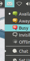
如果您查看指示消息菜单的屏幕截图,它看起来确实很棒(图标来自 Numix 图标主题),但指示在线状态的“项目符号”具有与菜单背景颜色相同的颜色,因此是不可见的......
我不想更改菜单的颜色,但想更改项目符号的颜色,这是可能的,因为其他主题有不同的颜色。我已经安装了,gnome-color-chooser但我找不到更改此特定颜色的选项。
我愿意自己更改相应 .css 文件中的行,但我现在需要知道如何调用相应的变量。
有人可以帮忙吗?
编辑:我发现由于同样的原因,电池指示器和蓝牙指示器等中的复选标记也不可见。是否也可以更改菜单图标和文本之间的距离?
答案1
您已对主题 css 文件进行了操作。
在 css 文件中搜索“bullet”并进行更改,然后查看结果。尝试将 @theme_selected_fg_color 更改为白色的或任何其他颜色并观察差异。
需要更改的文件是:
Flatstudio/gtk-3.0/menu.css Flatstudio/gtk-3.0/menu_frame.css
在 menu.css 中:
改变这一点:
 .menuitem:hover,
.menu .menuitem:hover {
    /* contextual menu item-selected */
    background-image: -gtk-gradient (linear, left top, left bottom,
                                     from (shade (@theme_selected_bg_color, 1.0)),
                                     to   (shade (@theme_selected_bg_color, 1.0)));
    color: @theme_selected_fg_color;
    text-shadow: 0px 1px @theme_selected_shadow_color;
    -unico-bullet-color: @theme_selected_fg_color;
}
对此
.menuitem:hover,
.menu .menuitem:hover {
    /* contextual menu item-selected */
    background-image: -gtk-gradient (linear, left top, left bottom,
                                     from (shade (@theme_selected_bg_color, 1.0)),
                                     to   (shade (@theme_selected_bg_color, 1.0)));
    color: #ffffff;
    text-shadow: 0px 1px @theme_selected_shadow_color;
    -unico-bullet-color: #ffffff;
}
并将其更改为:
.menuitem.check:active:hover,
.menuitem.radio:active:hover {
    border-width: 0px;
    border-style: none;
    background-image: none;
    background-color: @theme_selected_bg_color;
    color: @theme_selected_fg_color;
    -unico-bullet-color: @theme_selected_fg_color;
}
对此
  .menuitem.check:active:hover,
    .menuitem.radio:active:hover {
        border-width: 0px;
        border-style: none;
        background-image: none;
        background-color: @theme_selected_bg_color;
        color: #ffffff;
        -unico-bullet-color: #ffffff;
    }
现在转到另一个文件 menu_frame.css:
改变这个:
.menuitem:hover,
.menu .menuitem:hover {
    /* contextual menu item-selected */
    background-image: -gtk-gradient (linear, left top, left bottom,
                                     from (shade (@theme_selected_bg_color, 1.0)),
                                     to   (shade (@theme_selected_bg_color, 1.0)));

    color: @theme_selected_fg_color;
    text-shadow: 0px 1px @theme_selected_shadow_color;
    -unico-bullet-color: @theme_selected_fg_color;
}
对此
.menuitem:hover,
.menu .menuitem:hover {
    /* contextual menu item-selected */
    background-image: -gtk-gradient (linear, left top, left bottom,
                                     from (shade (@theme_selected_bg_color, 1.0)),
                                     to   (shade (@theme_selected_bg_color, 1.0)));

    color: #ffffff;
    text-shadow: 0px 1px @theme_selected_shadow_color;
    -unico-bullet-color: #ffffff;
}
并将其更改为:
.toolbar .menuitem:hover,
Genericmenuitem .menuitem:hover,
DbusmenuGtkMenu .menuitem:hover,
.primary-toolbar .menuitem:hover,
.menubar.menuitem:hover,
.menubar .menuitem:hover {
    /* dark menu item-selected */
    background-image: -gtk-gradient (linear, left top, left bottom,
                                     from (shade (@theme_selected_bg_color, 1.0)),
                                     to   (shade (@theme_selected_bg_color, 1.0)));

    color:@theme_selected_fg_color;
    text-shadow: 0px 1px @theme_selected_shadow_color;
    -unico-bullet-color: @theme_selected_fg_color;

    border-image: none;
}
对此
.toolbar .menuitem:hover,
Genericmenuitem .menuitem:hover,
DbusmenuGtkMenu .menuitem:hover,
.primary-toolbar .menuitem:hover,
.menubar.menuitem:hover,
.menubar .menuitem:hover {
    /* dark menu item-selected */
    background-image: -gtk-gradient (linear, left top, left bottom,
                                     from (shade (@theme_selected_bg_color, 1.0)),
                                     to   (shade (@theme_selected_bg_color, 1.0)));

    color:#ffffff;
    text-shadow: 0px 1px @theme_selected_shadow_color;
    -unico-bullet-color: #ffffff;

    border-image: none;
}
最后修改如下:
.menuitem.check:active,
.menuitem.radio:active {
    border-width: 0px;
    border-style: none;
    background-image: none;
    background-color: @menu_bg_color;
    /* contextual menu check */
    color: @theme_selected_fg_color;
    -unico-bullet-color: @theme_selected_fg_color;
}
更改为:
.menuitem.check:active,
.menuitem.radio:active {
    border-width: 0px;
    border-style: none;
    background-image: none;
    background-color: @menu_bg_color;
    /* contextual menu check */
    color: #ffffff;
    -unico-bullet-color: #ffffff;
}
我测试了一下,结果如下:
前
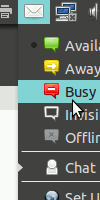
后