

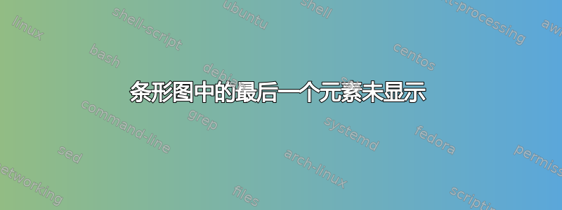
我使用以下代码在 latex 中创建条形图,但最后的坐标未显示在条形图上。我不确定我做错了什么。那里没有任何警告或类似的东西。
\begin{figure}[!htpb]
\pgfplotsset{width=0.8 \textwidth, height = 4.5cm}
\centering
\caption{Area Under the ROC Curves (AUROC) of Pandapas Network Inference by Banjo 2.2.0 and TDBN}
\label{pandapas_auroc_banjo}
\begin{tikzpicture}
\begin{axis}[every axis plot post,
    symbolic x coords={ i2, max50, kmeans2, q3, TDT, bikmeans3, max25, q4, i3, max75, bikmeans5, q5, kmeans3, i4,
    mean, q2, kmeans5, i5, kmeans4, top25, bikmeans4, top75, bikmeans2, },
    xtick=data, x tick label style = {rotate=90}, ylabel= AUROC, ybar interval=.6, enlargelimits=0.18, legend pos=north east]
    \addplot [fill = green!40] coordinates {
    (i2, 0.8998)
    (max50, 0.8982)
    (kmeans2, 0.8864)
    (q3, 0.886919)
    (TDT, 0.8872)
    (bikmeans3, 0.8789)
    (max25, 0.8781)
    (q4, 0.878148)
    (i3, 0.8632)
    (max75, 0.8628)
    (bikmeans5, 0.862)
    (q5, 0.853671)
    (kmeans3, 0.852857)
    (i4, 0.85119)
    (mean, 0.8475)
    (q2, 0.846)
    (kmeans5, 0.843333)
    (i5, 0.837429)
    (kmeans4, 0.827778)
    (top25, 0.8075)
    (bikmeans4, 0.804)
    (top75, 0.7175)
    (bikmeans2, 0.495)
    };
    \legend{Banjo 2.2.0}
\end{axis}
\end{tikzpicture}
\begin{tikzpicture}
\begin{axis}[every axis plot post,
    symbolic x coords={i2, mean, top25, max25, bikmeans2, top75, kmeans2, TDT, max50, max75, q2, },
    xtick=data, x tick label style = {rotate=90}, ylabel= AUROC,  ybar interval=.5, enlargelimits=0.15,]
    \addplot [fill = cyan!40] coordinates {
    (i2, 0.659474)
    (mean, 0.623158)
    (top25, 0.597544)
    (max25, 0.552632)
    (bikmeans2, 0.549474)
    (top75, 0.549123)
    (kmeans2, 0.500877)
    (TDT, 0.500877)
    (max50, 0.5)
    (max75, 0.5)
    (q2, 0.458246)
    };
     \legend{TDBN}
\end{axis}
\end{tikzpicture}
\end{figure}
这是我编译后得到的结果:

答案1
您没有ybar interval正确使用此选项。根据pgfplots 包的文档(§4.5,第 87 页):
\addplot+[ybar interval]此绘图类型会生成宽度(和偏移)相对于坐标间隔的垂直条。使用间隔时有一个概念上的区别:间隔由两个坐标定义。由于
ybar每个间隔都有一个值,因此i第条定义为
- 第 th 个坐标的 y 值
i,- 第个坐标的 x 值
i作为左间隔边界,- 第个坐标的x值
(i + 1)作为右区间边界。最后,多了一个坐标:最后一个坐标仅用于确定间隔宽度;其 y 值不会影响条形的外观。
如果您想保留该ybar interval图,那么显而易见的解决方案是引入一个虚拟符号坐标(每个图)并将其用作最后一个坐标,将任何值作为 y 值。例如,对于您的第二个图:
\begin{tikzpicture}
\begin{axis}[every axis plot post,
    symbolic x coords={i2, mean, top25, max25, bikmeans2, top75,
                       kmeans2, TDT, max50, max75, q2,
                       DUMMY},
    xtick=data, x tick label style={rotate=90}, ylabel=AUROC,
    ybar interval=.5,
    enlargelimits=0.15]
    \addplot [fill = cyan!40] coordinates {
      (i2, 0.659474)
      (mean, 0.623158)
      (top25, 0.597544)
      (max25, 0.552632)
      (bikmeans2, 0.549474)
      (top75, 0.549123)
      (kmeans2, 0.500877)
      (TDT, 0.500877)
      (max50, 0.5)
      (max75, 0.5)
      (q2, 0.458246)
      (DUMMY, 0)
    };
     \legend{TDBN}
\end{axis}
\end{tikzpicture}

答案2
在我看来,您似乎想要获得ybar情节ybar interval。
\documentclass{article}
\usepackage{pgfplots}
\pgfplotsset{compat=1.14}
\begin{document}
\begin{figure}[!htpb]
\pgfplotsset{
    width=0.8 \textwidth,
    height = 4.5cm,
    %every axis plot post,
    tick pos=left,
    xtick=data,
    x tick label style = {rotate=90},
    ylabel= AUROC,
    ybar,
    ymin=0,
}
\centering
\caption{Area Under the ROC Curves (AUROC) of Pandapas Network Inference by Banjo 2.2.0 and TDBN}
\label{pandapas_auroc_banjo}
\begin{tikzpicture}
\begin{axis}[
        symbolic x coords={ i2, max50, kmeans2, q3, TDT, bikmeans3, max25, q4, i3, max75, bikmeans5,
            q5, kmeans3, i4, mean, q2, kmeans5, i5, kmeans4, top25, bikmeans4, top75, bikmeans2, },
        ymax=1.2,
        bar width=5pt,
        enlarge x limits=0.05,
    ]
    \addplot [fill = green!40] coordinates {
    (i2, 0.8998)
    (max50, 0.8982)
    (kmeans2, 0.8864)
    (q3, 0.886919)
    (TDT, 0.8872)
    (bikmeans3, 0.8789)
    (max25, 0.8781)
    (q4, 0.878148)
    (i3, 0.8632)
    (max75, 0.8628)
    (bikmeans5, 0.862)
    (q5, 0.853671)
    (kmeans3, 0.852857)
    (i4, 0.85119)
    (mean, 0.8475)
    (q2, 0.846)
    (kmeans5, 0.843333)
    (i5, 0.837429)
    (kmeans4, 0.827778)
    (top25, 0.8075)
    (bikmeans4, 0.804)
    (top75, 0.7175)
    (bikmeans2, 0.495)
    };
    \legend{Banjo 2.2.0}
\end{axis}
\end{tikzpicture}
\begin{tikzpicture}
\begin{axis}[
        symbolic x coords={i2, mean, top25, max25, bikmeans2, top75, kmeans2, TDT, max50, max75, q2, },
        enlarge x limits=0.1
    ]
    \addplot [fill = cyan!40] coordinates {
    (i2, 0.659474)
    (mean, 0.623158)
    (top25, 0.597544)
    (max25, 0.552632)
    (bikmeans2, 0.549474)
    (top75, 0.549123)
    (kmeans2, 0.500877)
    (TDT, 0.500877)
    (max50, 0.5)
    (max75, 0.5)
    (q2, 0.458246)
    };
     \legend{TDBN}
\end{axis}
\end{tikzpicture}
\end{figure}
\end{document}
结果:
