

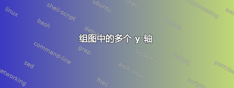
我想创建一个包含三个组的条形图。比较两个标准。为了使这里更全面,我已经生成了图

我使用以下示例来解决这个问题堆叠条形图/组图,x 坐标上有文本标签。您可以看到,与标准 2 相比,标准 1 的值非常小。因此问题是:
如何为第二个标准的值创建第二个 y 轴?如何缩放它们?
梅威瑟:
\documentclass{standalone}
\usepackage{pgfplots,pgfplotstable}
\usetikzlibrary{pgfplots.groupplots}
\pgfplotsset{compat=newest,legend columns=-1}

\pgfplotstableread{
Criterion   criterion1  criterion2
part1       8           2349
part2       8           452
part3       14          1006
}\first

\pgfplotstableread{
Criterion   criterion1  criterion2
part1       36          10220
part2       36          5891
part3       85          3160
}\second

\pgfplotstableread{
Criterion   criterion1  criterion2
part1       97          25657
part2       97          18306
part3       184         7461
}\third

\begin{document}

\begin{tikzpicture}
  \begin{groupplot}
    [group style={%
    columns=3,
    group name=plots,
    xlabels at=edge bottom,
    y descriptions at=edge left,
    },
    ybar,
    ymin=0,
    ymax=27e3,
    enlarge x limits={abs=.5},
    width=0.45\textwidth,
    height=0.6\textwidth,
    scaled y ticks=base 10:-3,
    xticklabels from table={\first}{Criterion},
    x tick label style={rotate=90,anchor=east},
    xtick=data,
    ]

    \nextgroupplot[xlabel=item1,legend to name=grouplegend,ylabel=y-label]
    \pgfplotstableforeachcolumn\first\as\col{%
        \ifnum\pgfplotstablecol=0
        \else
        \edef\tmp{%
            \noexpand\addplot table [x expr=\noexpand\coordindex,y=\col] {\noexpand\first};
            \noexpand\addlegendentry {\col}%
        }%
        \tmp
        \fi
    }

    \nextgroupplot[xlabel=item2]
    \pgfplotstableforeachcolumn\second\as\col{%
        \ifnum\pgfplotstablecol=0
        \else
        \edef\tmp{%
            \noexpand\addplot table [x expr=\noexpand\coordindex,y=\col] {\noexpand\second};
        }%
        \tmp
        \fi
    }

    \nextgroupplot[xlabel=item3]
    \pgfplotstableforeachcolumn\third\as\col{%
        \ifnum\pgfplotstablecol=0
        \else
        \edef\tmp{%
            \noexpand\addplot table [x expr=\noexpand\coordindex,y=\col] {\noexpand\third};
        }%
        \tmp
        \fi
    }
  \end{groupplot}

  \node at (plots c2r1.north) [anchor=south, yshift=.6cm] {\ref{grouplegend}};
\end{tikzpicture}

\end{document}
答案1
使用时组合不同 y 轴的方法groupplots与仅使用一个图的方法非常相似:在第一组图的顶部绘制第二组图,隐藏轴线和轴标签,并将 y(刻度)标签移动到另一侧:

\documentclass{article}
\usepackage{pgfplots,pgfplotstable}
\usetikzlibrary{pgfplots.groupplots}
\pgfplotsset{compat=1.4}

\pgfplotstableread{
Criterion   Wasserverbrauch   {CO$_2$-Emission}
Komp        8           2349
Komp+PV 8           452
Sorp        14          1006
}\Rapperswil

\pgfplotstableread{
Criterion   Wasserverbrauch   {CO$_2$-Emission}
Komp        36          10220
Komp+PV 36          5891
Sorp        85          3160
}\Palermo

\pgfplotstableread{
Criterion   Wasserverbrauch   {CO$_2$-Emission}
Komp        97          25657
Komp+PV 97          18306
Sorp        184         7461
}\Jeddah

\begin{document}

\begin{tikzpicture}
\pgfplotsset{
    water/.style={
        fill=cyan,
        draw=cyan!50!black
    },
    co2/.style={
        fill=orange,
        draw=orange!50!black
    }
}

  \begin{groupplot}[
    group style={
        columns=3,
        group name=plots,
        x descriptions at=edge bottom,
        y descriptions at=edge left,
    },
    ylabel={[ML]}, ylabel style=cyan!50!black,
    yticklabel style=cyan!50!black,
    ybar, /pgf/bar shift=-6pt, % We have to manually move the bars
    ymin=0, ymax=270,
    enlarge x limits={abs=.5},
    width=0.4\textwidth,
    height=0.6\textwidth,
    xticklabels from table={\Rapperswil}{Criterion},
    x tick label style={rotate=90,anchor=east},
    xtick=data, xtick pos=left,
    legend columns=2]

    \nextgroupplot[xlabel=Rapperswil,legend to name=grouplegend]
    \addplot [water] table [x expr=\coordindex,y index=1] {\Rapperswil};
        \addlegendentry {Wasserverbrauch}%
    \addlegendimage{co2,ybar legend}
        \addlegendentry{CO$_2$-Emission}

    \nextgroupplot[xlabel=Palermo]
    \addplot [water] table [x expr=\coordindex,y index=1] {\Palermo};

    \nextgroupplot[xlabel=Jeddah]
     \addplot [water] table [x expr=\coordindex,y index=1] {\Jeddah};
  \end{groupplot}

  \begin{groupplot}
    [group style= {
        columns=3,
        group name=plots,
        y descriptions at=edge right,
    },
    ybar, /pgf/bar shift=6pt,
    ymin=0, ymax=2.7e4,
    enlarge x limits={abs=.5},
    width=0.4\textwidth,
    height=0.6\textwidth,
    xtick=\empty, axis line style=transparent,
    ylabel={[kg CO$_2$ per year]},yticklabel style=orange!75!black,
    ylabel style=orange!75!black]

    \nextgroupplot[scaled y ticks=false]
    \addplot [co2] table [x expr=\coordindex,y index=2] {\Rapperswil};

    \nextgroupplot[scaled y ticks=false]
     \addplot [co2] table [x expr=\coordindex,y index=2,
        ] {\Palermo};

    \nextgroupplot
     \addplot [co2] table [x expr=\coordindex,y index=2] {\Jeddah};
  \end{groupplot}

  \node at (plots c2r1.north) [anchor=south, yshift=.6cm] {\ref{grouplegend}};
\end{tikzpicture}

\end{document}