

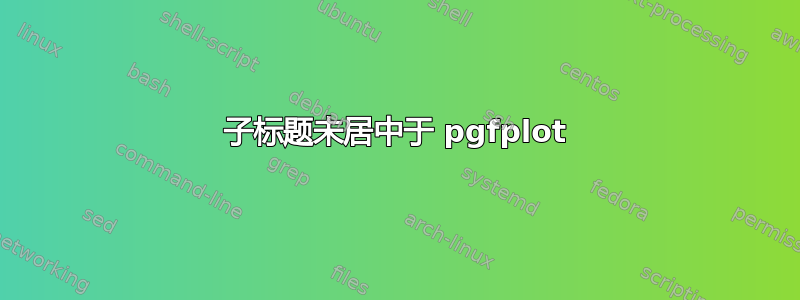
这是我第一次使用并排的 pgfplots,所以我有点不适应。然而,我注意到每个面板的子标题并不以图形为中心,如下所示:
对于面板 (a),它似乎居中了 - 但我更喜欢像 x 标签那样居中,它们以图形上可见的内容为中心 - 并且没有任何空白(如果这有意义的话)。但是,对于面板 (b),我无法让子标题居中,即使我使用了相同的代码。
我的代码如下:
\usepackage{pgfplots, pgfplotstable}
\usepackage{subcaption}
\documentclass[]{bachelor}
\LoadClass[a4paper]{report}
\begin{figure}[!h]
        \centering
    \begin{subfigure}{.475\linewidth}
            \centering
            \pgfplotsset{scaled x ticks=false}
            \caption{Peer rank vs. \\ Average Annual Search Fraction}
        \begin{tikzpicture}
            \begin{axis}[width=7cm,height=10cm,
            ylabel={Peer Rank},
            xlabel={Average Annual Search Fraction},
            xmin=0,
            xmax=4,
            ymin=-5,
            ymax=100,
            xtick={0,1,2,3,4},
            axis background/.style={fill=gray!5},
            xtick pos=lower,ytick pos=left,
            xtick style={draw=none},
            xticklabel=\pgfkeys{/pgf/number format/.cd,fixed,precision=0,zerofill}\pgfmathprintnumber{\tick}\%,
            ]

            \addplot table [x=c, y=b, col sep=comma] {Datafiles/rankvsasf1.csv};

            \end{axis}

        \end{tikzpicture}

    \end{subfigure}
        \hfill

    \begin{subfigure}{.475\linewidth}
            \centering
            \caption{Log Peer Rank vs. \\ Log average Annual Search Fractions}
        \begin{tikzpicture}
            \begin{axis}[width=7cm,height=10cm,
            ylabel={Log Peer Rank},
            xlabel={Log Average Annual Search Fraction},
            xmin=-6,
            xmax=-2,
            ymin=-0,
            ymax=4,
            xtick={-6,-5,-4,-3,-2},
            axis background/.style={fill=gray!5},
            xtick pos=lower,ytick pos=left,
            xtick style={draw=none},
        ]

            \addplot table [x=x, y=y, col sep=comma] {Datafiles/loglog.csv};

            ]

      \draw[->,shorten >=1mm,shorten <=1mm] (rel axis cs:0.45,0.9) node[right,draw,align=left] {y=-6.38-1.63x\\ $R^2$=99.7\%};


            \end{axis}

        \end{tikzpicture}

    \end{subfigure}
\end{figure}
答案1
该解决方案将标题放在 tikzpicture 中的节点内,仅使用轴的宽度。
我尝试将 tikzpicture 相对于轴置于中心,但是它在右侧浪费了太多空间。
\documentclass[a4paper]{report}
\usepackage[margin=2cm,showframe]{geometry}% default not wide enough
\usepackage{pgfplots, pgfplotstable}
\usepackage{subcaption}
\captionsetup[subfigure]{justification=centering, singlelinecheck=false}

\newlength{\tempwidth}

\begin{document}
\begin{figure}[htb]% !h is just embarrassing.
        \centering
    \begin{subfigure}{.475\linewidth}
            \centering
            \pgfplotsset{scaled x ticks=false}
        \begin{tikzpicture}
            \begin{axis}[width=7cm,height=10cm,
            ylabel={Peer Rank},
            xlabel={Average Annual Search Fraction},
            xmin=0,
            xmax=4,
            ymin=-5,
            ymax=100,
            xtick={0,1,2,3,4},
            axis background/.style={fill=gray!5},
            xtick pos=lower,ytick pos=left,
            xtick style={draw=none},
            xticklabel=\pgfkeys{/pgf/number format/.cd,fixed,precision=0,zerofill}\pgfmathprintnumber{\tick}\%,
            name=border
            ]
            %\addplot table [x=c, y=b, col sep=comma] {Datafiles/rankvsasf1.csv};% file not found
            \end{axis}
        %place caption above axis
            \pgfextractx{\tempwidth}{\pgfpointdiff{\pgfpointanchor{border}{west}}{\pgfpointanchor{border}{east}}}%
            \node[above] at (border.north) {\begin{minipage}{\tempwidth}
              \caption{Peer rank vs. \\ Average Annual Search Fraction}
            \end{minipage}};
        \end{tikzpicture}

    \end{subfigure}\hfill
    \begin{subfigure}{.475\linewidth}
            \centering

        \begin{tikzpicture}
            \begin{axis}[width=7cm,height=10cm,
            ylabel={Log Peer Rank},
            xlabel={Log Average Annual Search Fraction},
            xmin=-6,
            xmax=-2,
            ymin=-0,
            ymax=4,
            xtick={-6,-5,-4,-3,-2},
            axis background/.style={fill=gray!5},
            xtick pos=lower,ytick pos=left,
            xtick style={draw=none},
            name=border
        ]
            %\addplot table [x=x, y=y, col sep=comma] {Datafiles/loglog.csv};% file not found
            ]
      \draw[->,shorten >=1mm,shorten <=1mm] (rel axis cs:0.45,0.9) node[right,draw,align=left] {y=-6.38-1.63x\\ $R^2$=99.7\%};
            \end{axis}
        %place caption above axis
            \pgfextractx{\tempwidth}{\pgfpointdiff{\pgfpointanchor{border}{west}}{\pgfpointanchor{border}{east}}}%
            \node[above] at (border.north) {\begin{minipage}{\tempwidth}
              \caption{Log Peer Rank vs. \\ Log average Annual Search Fractions}
            \end{minipage}};
        \end{tikzpicture}

    \end{subfigure}
\end{figure}
\end{document}
答案2
这是 John 的答案的修改版本。您可以使用 来代替测量轴的宽度text width=\pgfkeysvalueof{/pgfplots/width},并且我在 中添加标题,而不是单独的title节点axis。
text width=\pgfkeysvalueof{/pgfplots/width}实际上使标题节点比轴本身更宽一些,因为inner sep节点的两倍是另外加上的,并且因为轴框的宽度比scale only axis不包含时的定义宽度小 45pt。
我还展示了一种制作总体布局的不同方法,即使用一个环境groupplot而不是两个subfigure环境。这样可以稍微缩短代码。请注意,我在标题中使用了\subcaption而不是。\caption
\documentclass[a4paper]{report}
\usepackage[margin=2cm,showframe]{geometry}% default not wide enough
\usepackage{pgfplots}
\usepgfplotslibrary{groupplots} % <-- added
\usepackage{subcaption}
\captionsetup[subfigure]{justification=centering, singlelinecheck=false}

\newlength{\tempwidth}

\begin{document}
\begin{figure}[htb]
        \centering
    \begin{subfigure}{.475\linewidth}
            \centering
            \pgfplotsset{scaled x ticks=false}
        \begin{tikzpicture}
            \begin{axis}[width=7cm,height=10cm,
            ylabel={Peer Rank},
            xlabel={Average Annual Search Fraction},
            xmin=0,
            xmax=4,
            ymin=-5,
            ymax=100,
            xtick={0,1,2,3,4},
            axis background/.style={fill=gray!5},
            xtick pos=lower,ytick pos=left,
            xtick style={draw=none},
            xticklabel=\pgfkeys{/pgf/number format/.cd,fixed,precision=0,zerofill}\pgfmathprintnumber{\tick}\%,
            title style={text width=\pgfkeysvalueof{/pgfplots/width}},% this is actually a bit wider than the axis
            title=\caption{Peer rank vs. \\ Average Annual Search Fraction}
            ]
            %\addplot table [x=c, y=b, col sep=comma] {Datafiles/rankvsasf1.csv};% file not found
            \end{axis}

        \end{tikzpicture}

    \end{subfigure}\hfill
    \begin{subfigure}{.475\linewidth}
            \centering

        \begin{tikzpicture}
            \begin{axis}[width=7cm,height=10cm,
            ylabel={Log Peer Rank},
            xlabel={Log Average Annual Search Fraction},
            xmin=-6,
            xmax=-2,
            ymin=-0,
            ymax=4,
            xtick={-6,-5,-4,-3,-2},
            axis background/.style={fill=gray!5},
            xtick pos=lower,ytick pos=left,
            xtick style={draw=none},
            title style={text width=\pgfkeysvalueof{/pgfplots/width}},
            title=\caption{Log Peer Rank vs. \\ Log average Annual Search Fractions}
        ]
            %\addplot table [x=x, y=y, col sep=comma] {Datafiles/loglog.csv};% file not found
            ]
      \draw[->,shorten >=1mm,shorten <=1mm] (rel axis cs:0.45,0.9) node[right,draw,align=left] {$y=-6.38-1.63x$\\ $R^2=99.7\%$};
            \end{axis}
        \end{tikzpicture}

     \end{subfigure}
\end{figure}

\begin{figure}[htb]
\centering
\begin{tikzpicture}
    \begin{groupplot}[
       group style={
         group size={2 by 1},
         horizontal sep=2cm
       },
       width=7cm,height=10cm,
       axis background/.style={fill=gray!5},
       xtick pos=lower,ytick pos=left,
       xtick style={draw=none},
       title style={text width=\pgfkeysvalueof{/pgfplots/width}}, % this is actually a bit wider than the axis
       ]

       \nextgroupplot[
            ylabel={Peer Rank},
            xlabel={Average Annual Search Fraction},
            xmin=0,
            xmax=4,
            ymin=-5,
            ymax=100,
            scaled x ticks=false,
            xtick={0,1,2,3,4},
            xticklabel={\pgfmathprintnumber[/pgf/number format/.cd,fixed,precision=0,zerofill]{\tick}\%},
            title=\subcaption{Peer rank vs. \\ Average Annual Search Fraction}
            ]

            %\addplot table [x=c, y=b, col sep=comma] {Datafiles/rankvsasf1.csv};% file not found

       \nextgroupplot[
            ylabel={Log Peer Rank},
            xlabel={Log Average Annual Search Fraction},
            xmin=-6,
            xmax=-2,
            ymin=-0,
            ymax=4,
            xtick={-6,-5,-4,-3,-2},
            xtick style={draw=none},
            title=\subcaption{Log Peer Rank vs. \\ Log average Annual Search Fractions}
        ]
            %\addplot table [x=x, y=y, col sep=comma] {Datafiles/loglog.csv};% file not found
            ]
      \draw[->,shorten >=1mm,shorten <=1mm] (rel axis cs:0.45,0.9) node[right,draw,align=left] {$y=-6.38-1.63x$\\ $R^2=99.7\%$};
            \end{groupplot}
        \end{tikzpicture}


\end{figure}
\end{document}