

我想用 来表示这两个图tikzpicture。我不需要像下面这样将它们连接在一起,但我希望有类似的东西。

我可以生成如下的散点图:

我有两个唯一/不同的集群。我想像监督学习示例中那样绘制线性可分线,同时在无监督学习示例中绘制集群。
此外,如果拥有颜色/更大的点就更好了。
代码:
\documentclass{article}
\usepackage{pgfplots}
\begin{document}
\begin{tikzpicture}
\begin{axis}[%
axis lines = left,
xlabel = x,
ylabel = y,
]
\addplot[only marks] table [%
x = x,
y = y,
col sep = comma]{
    x, y
    %cluster 1
    2, 3
    3, 5
    4, 5
    3, 8
    5, 9
    3, 2
    5, 6
    6, 6
    7, 9
    10, 4
    11, 5
    9, 4
    %cluser 2

    20, 10
    21, 12
    24, 12
    25, 13
    27, 14
    22, 13
    23, 15
    25, 10
    15, 14
 };
\end{axis}
\end{tikzpicture}
\end{document}
答案1
您可以使用scatter/classes来以不同的方式格式化两个群集中的点,但将其拆分成两个更简单\addplot。要设置格式,请使用例如\addplot [blue, only marks, mark=*, mark size=5] ...,我想这大多是不言自明的。
对于线和圆,这几乎只是使用普通 TikZ 命令的情况。请注意,默认情况下,如果您在环境\draw (x,y) ..中执行此操作axis,x并且y不在 的坐标系中axis。除非您可以 a) 使用(axis cs:x,y),或者 b) 添加\pgfplotsset{compat=1.11}(或更高的版本号),在这种情况下axis cs将成为默认情况。
进一步注意,我认为circle[radius=2]在 内axis需要compat=1.11,但半径再次以轴坐标表示,因此在这种情况下它将变成椭圆。您可以做的是定义 内的坐标axis,并在其外部绘制圆。以下代码演示了这两种方法。

\documentclass{article}
\usepackage{pgfplots}
\pgfplotsset{compat=1.11} % <-- added
\begin{document}
\begin{tikzpicture}
\begin{axis}[%
axis lines = left,
xlabel = $x$,
ylabel = $y$,
clip mode=individual % so things drawn by \draw and similar are not cut off
]
\addplot [blue, only marks, mark=*, mark size=5] table [%
x = x,
y = y,
col sep = comma]{
    x, y
    %cluster 1
    2, 3
    3, 5
    4, 5
    3, 8
    5, 9
    3, 2
    5, 6
    6, 6
    7, 9
    10, 4
    11, 5
    9, 4
    };

\addplot+[red, only marks, mark=*, mark size=5] table [%
x = x,
y = y,
col sep = comma]{
    x, y
    20, 10
    21, 12
    24, 12
    25, 13
    27, 14
    22, 13
    23, 15
    25, 10
    15, 14
 };

 % to be able to use axis coordinates with \draw directly you need
 % \pgfplotsset{compat=1.11} or a higher version
 % if that is not present, use (axis cs:4,14) instead of (4,14),
 % to specify that the values should be interpreted as axis coordinates
 \draw [dashed] (4,14) -- (25,2);

 % save a coordinate for use later
 \coordinate (c2) at (23,12);

 % the blue circle is drawn inside the axis environment, and in axis coordinates
 % hence it becomes an ellipse
 \draw [blue, dashed] (6,6) circle[radius=5];

\end{axis}

% the red circle is drawn outside the axis, so actually looks like a circle,
% but the radius has no relation to the axis coordinates
\draw [red, dashed] (c2) circle[radius=2cm];
\end{tikzpicture}
\end{document}
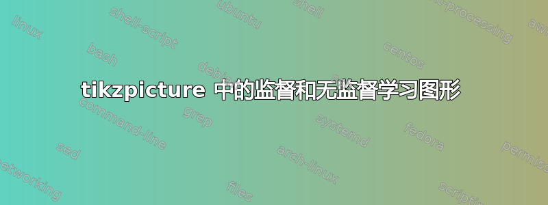
两个轴
有多种方法可以让两个图相邻。你可以tikzpicture一个接一个地添加两个 s,或者你可以axis在同一个环境中有两个环境tikzpicture,并用 定位第二个环境\begin{axis}[at={(x,y)},...。我个人喜欢库groupplot中的环境groupplots,它用于制作轴网格。

\documentclass{article}
\usepackage{pgfplots}
\usepgfplotslibrary{groupplots}
\pgfplotsset{compat=1.11}
\begin{document}
\begin{tikzpicture}
\begin{groupplot}[
group style={
  group size=2 by 1,
  horizontal sep=1.5cm
  },
axis lines = left,
xlabel = $x$,
ylabel = $y$,
width=5cm, % <-- set size of axes
clip mode=individual, % to avoid \draws being cut off
title style={yshift=1mm, font=\bfseries\sffamily}
]

\nextgroupplot[title=Supervised learning]
\addplot [blue, only marks, mark=*, mark size=3] table [%
x = x,
y = y,
col sep = comma]{
    x, y
    %cluster 1
    2, 3
    3, 5
    4, 5
    3, 8
    5, 9
    3, 2
    5, 6
    6, 6
    7, 9
    10, 4
    11, 5
    9, 4
    };

\addplot+[red, only marks, mark=*, mark size=3] table [%
x = x,
y = y,
col sep = comma]{
    x, y
    20, 10
    21, 12
    24, 12
    25, 13
    27, 14
    22, 13
    23, 15
    25, 10
    15, 14
 };

 % to be able to use axis coordinates with \draw directly you need
 % \pgfplotsset{compat=1.11} or a higher version
 % if that is not present, use (axis cs:4,14) instead of (4,14),
 % to specify that the values should be interpreted as axis coordinates
 \draw [dashed] (4,14) -- (25,2);


\nextgroupplot[title=Unsupervised learning]
\addplot [blue, only marks, mark=*, mark size=3] table [%
x = x,
y = y,
col sep = comma]{
    x, y
    %cluster 1
    2, 3
    3, 5
    4, 5
    3, 8
    5, 9
    3, 2
    5, 6
    6, 6
    7, 9
    10, 4
    11, 5
    9, 4
    };

\addplot+[red, only marks, mark=*, mark size=3] table [%
x = x,
y = y,
col sep = comma]{
    x, y
    20, 10
    21, 12
    24, 12
    25, 13
    27, 14
    22, 13
    23, 15
    25, 10
    15, 14
 };


 % save a coordinate for use later
 \coordinate (c2) at (23,12);

 % the blue circle is drawn inside the axis environment, and in axis coordinates
 % hence it becomes an ellipse
 \draw [blue, dashed] (6,6) circle[radius=5];

\end{groupplot}

% the red circle is drawn outside the axis, so actually looks like a circle,
% but the radius has no relation to the axis coordinates
\draw [red, dashed] (c2) circle[radius=1cm];


\end{tikzpicture}
\end{document}