

请考虑以下图表(代码见底部)。曲线是函数 q[D]=sqrt(2*s*D/h) 的结果,其中 h=0.01 且 s 分别等于 0.1(蓝色)和 0.01(绿色)。

现在,我想在上面的图的顶部添加两个轴,如下图所示。这两个轴必须通过函数 n[D]=D/(q[D])=sqrt(D*h/(2*s)) 进行缩放。也许还有一种我至今还没想到的替代解决方法?

\documentclass[11pt]{article}
\usepackage{tikz}
\usepackage{pgfplots}

\begin{document}

\begin{tikzpicture}
  \begin{axis}[
    xlabel=$D$,
    ylabel={$q$},axis x line=bottom, axis y line=left
  ]
    \addplot[blue,mark=none,domain=0:100, samples=50, smooth,enlargelimits=upper] {sqrt(2*0.1*x/0.01)};
    \addplot[green,mark=none,domain=0:100, samples=50, smooth,enlargelimits=upper] {sqrt(2*0.01*x/0.01)};
  \end{axis}
\end{tikzpicture}

\end{document}
答案1
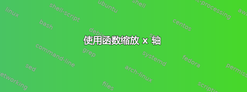
axis您可以使用其中的“虚拟”环境tikzpicture来生成图上方的轴线。只要确保轴范围相同,它们就会很好地对齐。要获取刻度值,您可以设置xticklabel={\pgfmathparse{sqrt(\tick*0.01/(2*#1))}\pgfmathprintnumber{\pgfmathresult}}将 D 值转换为 n(D)。这将得到类似于您发布的 Excel 输出的内容。
为了超越 Excel,我们还可以只绘制漂亮的圆形刻度值。我们希望能够指定要显示的刻度(例如 0、1、1.5 和 2),并让 PGFPlots 确定这些值在轴上的位置。这需要一点技巧:我们可以绘制 n(D) 函数反函数的不可见图,其中独立变量(在本例中为 n(D))绘制在 y 轴上,因变量(D)绘制在 x 轴上。通过使用选项xtick=data,刻度标签将仅出现在我们指定的样本位置。
这看起来似乎有很多工作要做,但是一旦我们弄清楚了,我们可以把它包装在一个小宏中\fakexaxis{<value for s>}{<vertical offset>}{<tick positions>},然后简单地说
  \begin{axis}[
    xlabel=$D$,
    ylabel={$q$},axis x line=bottom, axis y line=left
  ]
    \addplot[blue,mark=none,domain=0:100, samples=50, smooth,enlargelimits=upper] {sqrt(2*0.1*x/0.01)};
    \addplot[green,mark=none,domain=0:100, samples=50, smooth,enlargelimits=upper] {sqrt(2*0.01*x/0.01)};
  \end{axis}

 \fakexaxis{0.1}{7ex}{0,1,1.5,2}
 \fakexaxis{0.01}{2ex}{0,2,3,...,7}
生成以下输出。我认为这些努力是值得的……

\documentclass[11pt]{article}
\usepackage{tikz}
\usepackage{pgfplots}

\begin{document}

\newcommand{\fakexaxis}[3]{
  \begin{axis}[
    hide y axis,
    yshift=#2,
    axis x line=top,
    x axis line style={latex-},
    xlabel={$s=#1$}, every axis x label/.style={at={(1,1)}, anchor=west},
    domain=0:2,
    samples at={#3},
    xmin=0, xmax=100,
    % Convert from D to n(D)
    xticklabel={\pgfmathparse{sqrt(\tick*0.01/(2*#1))}\pgfmathprintnumber{\pgfmathresult}},
    % tick marks only at sample points
    xtick=data
  ]
  % Use the inverse function D = f(n(D)) to find values for D at which to place tick marks (don't actually draw the function)
  \addplot [draw=none] ({\x^2*2*#1/0.01},\x);
  \end{axis}
}

\begin{tikzpicture}
  \begin{axis}[
    xlabel=$D$,
    ylabel={$q$},axis x line=bottom, axis y line=left
  ]
    \addplot[blue,mark=none,domain=0:100, samples=50, smooth,enlargelimits=upper] {sqrt(2*0.1*x/0.01)};
    \addplot[green,mark=none,domain=0:100, samples=50, smooth,enlargelimits=upper] {sqrt(2*0.01*x/0.01)};
  \end{axis}

 \fakexaxis{0.1}{7ex}{0,1,1.5,2}
 \fakexaxis{0.01}{2ex}{0,2,3,...,7}


\end{tikzpicture}

\end{document}
答案2
这不是一个答案,而是太渴望评论了。您可以自己写一些东西,可能使用 TikZ 的功能\foreach和define function可能性,但我无法让它在轴内工作。也许有人可以解释一下?
\documentclass[11pt]{article}
\usepackage{tikz}
\usepackage{pgfplots}

\begin{document}

\pgfmathsetmacro{\h}{0.01}
\pgfmathsetmacro{\sOne}{0.1}
\pgfmathsetmacro{\sTwo}{0.01}

\begin{tikzpicture}[
    declare function={
        n(\d)= sqrt(\d*\h/(2*\sOne));
    }
  ]
  \begin{axis}[
    xlabel=$D$,
    ylabel={$q$},axis x line=bottom, axis y line=left
  ]
    \addplot[blue,mark=none,domain=0:100, samples=50, smooth,enlargelimits=upper] {sqrt(2*\sOne*x/\h)};
    \addplot[green,mark=none,domain=0:100, samples=50, smooth,enlargelimits=upper] {sqrt(2*\sTwo*x/\h)};

  \end{axis}
    \foreach \d in {5, 20, 35, 50, 65, 80, 95}
    {
        \node at (0.1*\d,-50pt) {\pgfmathparse{n(\d)}\pgfmathresult};
    }
\end{tikzpicture}
\end{document}
给你:
或者,您可以使用另一个程序/脚本计算刻度标签,并将它们包含xticklabels from table在 pgfplotsmanual 中(第 4.14 节)。